Adobe’s react-spectrum repo is trending hard today, and the part worth your attention isn’t React Spectrum (the opinionated Adobe design system) — it’s React Aria, the unstyled hooks layer underneath it. React Aria hands you fully WAI-ARIA-compliant behavior, keyboard navigation, and screen reader support for complex components like comboboxes, date pickers, and drag-and-drop lists — without touching your CSS.
Here’s how to wire it into a real React project, plus an honest take on when it’s worth the dependency and when it isn’t.
1. What React Aria actually is (and what it isn’t)
The repo ships three separable libraries. Most tutorials conflate them, which causes confusion:
- React Spectrum — Adobe’s fully styled component library. Looks like Adobe products. Not what you want if you have your own design system.
- React Aria — Unstyled hooks and components that provide behavior only: focus management, keyboard interactions, ARIA attributes, screen reader announcements. You own all the markup and CSS.
- React Stately — State management hooks that React Aria calls internally. You can use these independently on non-web targets like React Native.
The mental model: React Aria is closer to Headless UI or Radix than it is to MUI or Chakra. You’re getting the hard accessibility logic — the stuff that took Adobe engineers years to get right across 30+ screen reader and browser combinations — as a black box you can style however you want.
The components that make this genuinely useful are the complex ones: ComboBox, DatePicker, DateRangePicker, NumberField, Table with multi-select, DragAndDrop lists. These are the components where rolling your own accessible implementation takes days and you still miss edge cases.
2. Install and project setup
React Aria is published as individual packages under the @react-aria and @react-stately scopes, or as a single umbrella package. For a new project I’d start with the umbrella to avoid version skew:
      npm install react-aria react-stately
      # or
      yarn add react-aria react-stately
You’ll also want the components package if you prefer the new React Aria Components API (released stable in 2024) over the raw hooks:
      npm install react-aria-components
      # or
      yarn add react-aria-components
React Aria Components is the higher-level API — it gives you composable, unstyled JSX components rather than raw hooks. For most use cases it’s less boilerplate. The raw hooks are still there if you need to attach the behavior to a completely custom DOM structure.
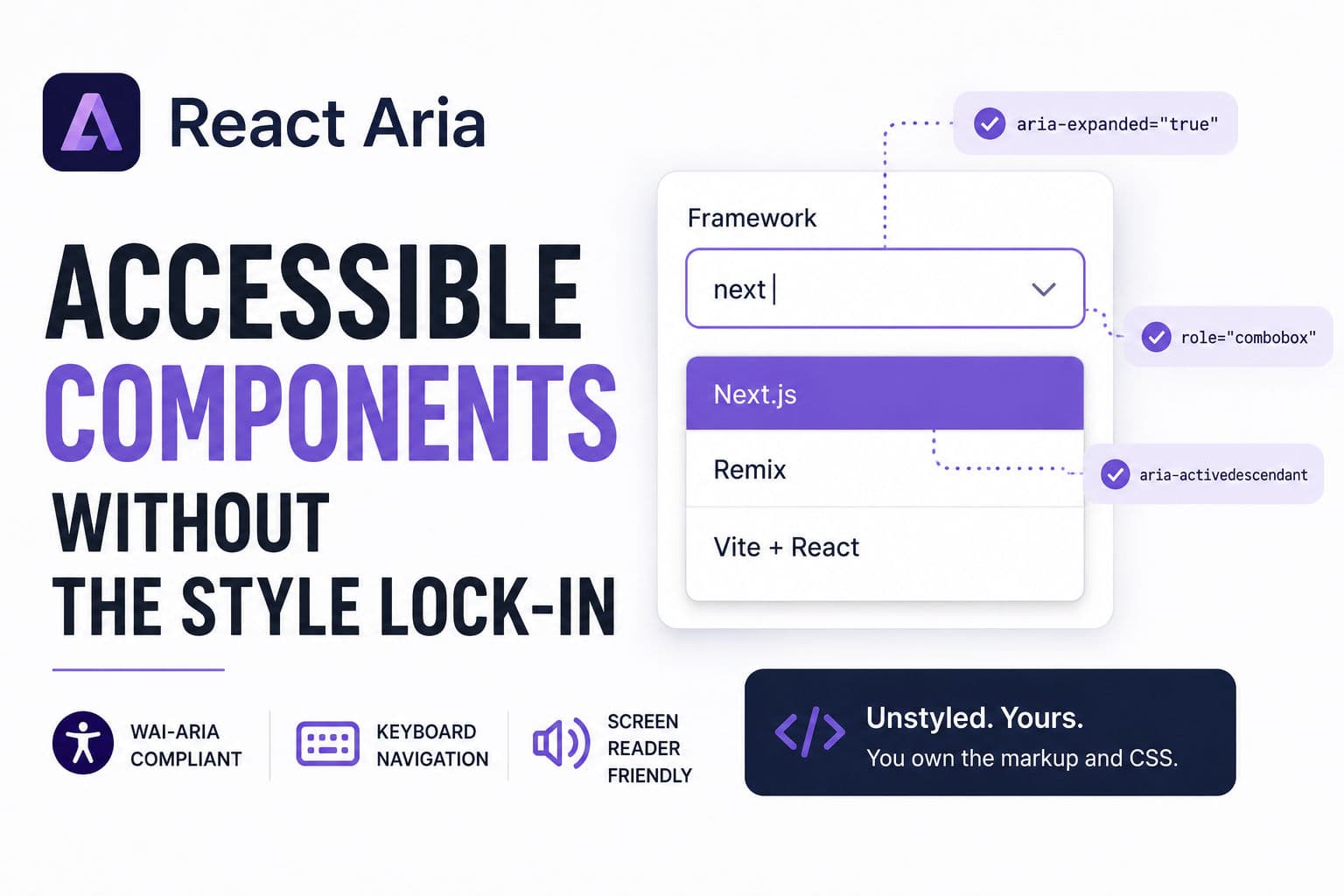
3. Building an accessible combobox from scratch
A combobox — the combination of a text input with a filtered dropdown — is one of the most accessibility-broken components on the web. Getting focus management, aria-activedescendant, aria-expanded, and keyboard selection right without a library is a multi-day job. Here’s how React Aria Components handles it:
      import {
        ComboBox,
        Input,
        Label,
        ListBox,
        ListBoxItem,
        Popover,
        Button,
      } from 'react-aria-components';

      const frameworks = [
        { id: 'next', name: 'Next.js' },
        { id: 'remix', name: 'Remix' },
        { id: 'vite', name: 'Vite + React' },
      ];

      export function FrameworkPicker() {
        return (
          <ComboBox defaultItems={frameworks}>
            <Label>Framework</Label>
            <Input />
            <Button>▼</Button>
            <Popover>
              <ListBox>
                {(item) => <ListBoxItem id={item.id}>{item.name}</ListBoxItem>}
              </ListBox>
            </Popover>
          </ComboBox>
        );
      }
A few things worth pointing out here. The ComboBox, Input, ListBox, and ListBoxItem components ship with zero visual styles — they’re rendering semantically correct HTML with all the right ARIA attributes wired up, but they look like browser defaults until you add CSS. That’s intentional. You drop your Tailwind classes, CSS modules, or styled-components on top.
The Label component uses htmlFor wiring internally, so screen readers announce the label correctly on focus. The ListBoxItem handles aria-selected, keyboard arrow navigation, and the Enter/Space selection events. You don’t write any of that.
For async filtering — the real-world case — you pass a controlled inputValue and onInputChange, debounce your fetch in the parent, and feed the results into items. The behavior stays identical; React Aria doesn’t care where the data comes from.
4. Production gotchas I’d warn you about
Bundle size isn’t small. The umbrella react-aria package pulls in a lot. If you only need two or three components, install the individual scoped packages (@react-aria/combobox, @react-aria/focus, etc.) and tree-shake properly. The components package is better about this than the raw hooks umbrella.
Styling is genuinely blank-slate. If your team expects “works out of the box” they’re going to be frustrated. There’s no default theme, no utility classes, nothing. You are building a design system, not consuming one. That’s the whole point, but it’s a culture mismatch for teams that want to move fast on UI.
The date/time components are surprisingly opinionated about locale. React Aria ships its own @internationalized/date package with its own date object abstraction (CalendarDate, ZonedDateTime, etc.). If your backend sends ISO strings, you’re writing adapters. Not a dealbreaker — the i18n story is actually excellent once you’re past the adapter layer — but budget time for it.
SSR needs attention. React Aria uses useId internally for ARIA attribute wiring. In React 18+ with useId from React core, this is fine. On older setups or non-standard SSR pipelines, you may see hydration mismatches. The fix is usually wrapping your app in the SSRProvider the library exports, but it’s easy to miss.
The raw hooks API has a steep learning curve. The hooks version (as opposed to the Components API) requires you to manually spread props objects onto your DOM elements — {...labelProps}, {...inputProps}, {...listBoxProps}. Miss one spread and accessibility silently breaks. The Components API is much safer for most teams.
5. When I’d actually reach for React Aria on a client project
The honest answer: React Aria earns its keep in a narrow but important category of projects. Here’s how I think about the decision.
Reach for it when: You’re building or extending a design system and you need enterprise-grade accessibility without paying for it in engineering time. If you have a combobox, date range picker, or drag-and-drop sortable list in scope — any one of those alone justifies the dependency. The WAI-ARIA spec for a combobox is 10+ pages; React Aria has already implemented it correctly across Firefox, Safari, VoiceOver, NVDA, and JAWS.
I’d also reach for it on any client-facing dashboard or form-heavy app where an accessibility audit is a contractual requirement. I’ve seen projects fail accessibility audits specifically on custom comboboxes and date pickers built without a library. React Aria removes that class of failure.
Skip it when: You’re building a marketing site with no complex interactive components. A navigation menu and a modal don’t need React Aria — a properly marked-up <dialog> and a well-structured nav element handle those fine. The library adds real weight and complexity; don’t bring it in unless you’re using the hard parts.
Also skip it if your team is already deep in Radix UI or Headless UI. They cover similar ground for many components. React Aria’s real differentiator is the date/time components and the internationalization depth — neither Radix nor Headless UI comes close there. If you don’t need those, the switching cost probably isn’t worth it mid-project.
One pattern I’ve settled on: use React Aria for exactly the components where the accessibility surface area is largest (date pickers, comboboxes, complex tables, drag lists), and use simpler solutions everywhere else. Mixing it with Radix for simple primitives like tooltips and popovers works fine — the two don’t conflict.
If you want to go deeper on React patterns and build the kind of component library that actually survives a production audit, the React tutoring I offer covers exactly this — design system architecture, accessibility patterns, and when to reach for a library versus rolling your own.
And if you’re working on a larger React application and want a second pair of eyes on the architecture, check out development consultation — the accessibility and component design questions come up in almost every engagement I do.